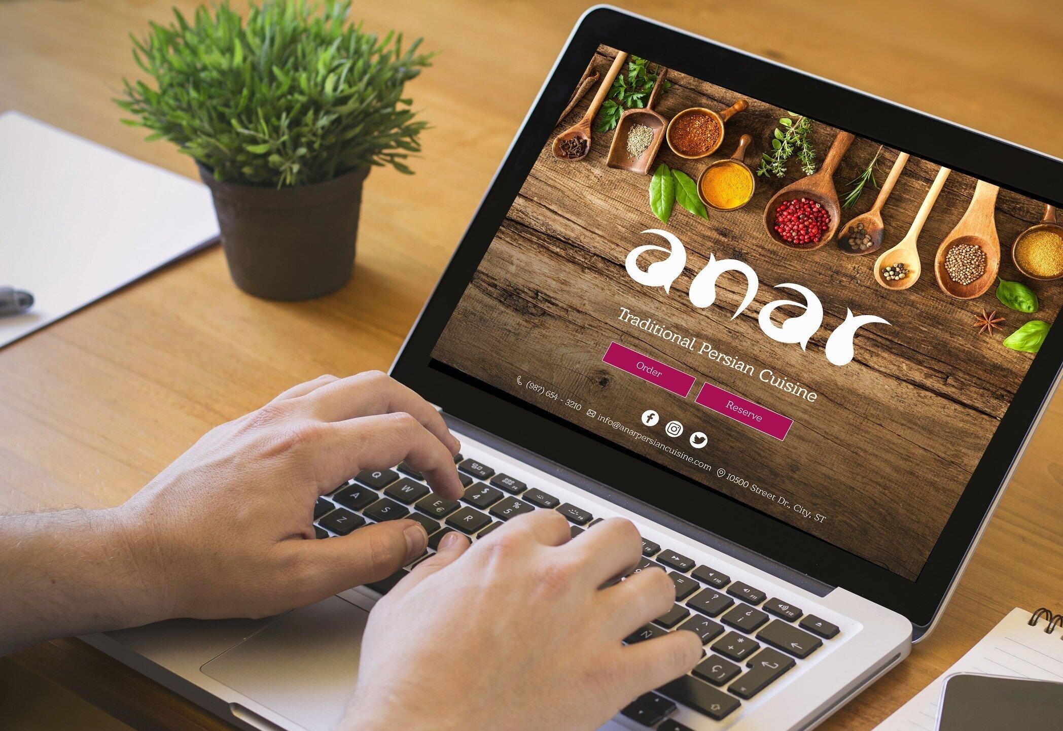
Branding design for Anar, a restaurant with traditional Persian cuisine.
Anar (pronounced anâr), in English, pomegranate, is a unique ingredient in Persian cuisine. In designing the restaurant’s branding, the organic form of the pomegranate is my main source of inspiration. On this page, please see sketches and ideation for the logo, finalized logo, business card design, exterior vinyl design, wireframes for the website, and mockup for Anar’s website.
Sketching for the logo of Anar.
It all begins with sketching. I like to use pencil and paper to ideate on different forms a logo can take and select from that. I then move the selected logo to the computer to make more iterations on the design and finesse the logo in illustrator.
Finalized Logo
-

Main Logo in magenta
Finalized refined logo for the restaurant. Using the form of the pomegranate, the logo also resembles a form of paisley as a traditional pattern used in Persian decorative design. Magenta is the main color for the logo.
-

Logo in black
Finalized and refined, the best practice is to show how the logo looks if used in monochrome. I decided the logo and the tagline to be black instead of gray spectrum, if used in a monochromatic design.
-

Logo in white
This pictures the desired look of the logo, in monochromatic design, with a dark background.
The idea is to not use this design on a crowded background.

Menu design and execution
Designed for the exterior of the restaurant


